Introduction
The average internet user may not notice it day by day, but web design trends are always changing. Here at CreativeWeb, our work this year has seen an increased use of mobile-first design, engaging graphics, and stronger focus on the customer journey.
Below are 8 trends that I foresee being widely implemented. So, let’s take a closer look at what each one entails, as well as some real-world examples!
1. Dark Mode
Dark mode is a low-light user interface that uses a dark colour as the main background colour. It’s the reversal of a typical white layout that designers have used for many years. In response to the increasing number of hours we spend on our phones, designers have discovered that dark theme layouts help with eye strain, especially in low-light surroundings.
Already a massive trend in 2020, dark mode is ready to become more even popular in 2021 too. Here are some reasons why designers love dark mode:
- It looks super-modern. Instagram, Twitter, Facebook and Apple are just a handful of brands that offer alternative themes on their platforms;
- It highlights and allows other design elements to pop;
- It incorporates a stylish and mysterious appearance that contributes to a website’s unique appearance;
- Easier on the eyes than traditional brighter screens, especially in a low-light environment;
- Reduces eye strain in low-light conditions;
- It can even save your mobile device’s battery power!
Dark mode is being implemented more and more, in mobile apps as well as website layouts. Not all website users prefer dark mode and some will want to switch back and forth between dark and light. Irrespective of how or why you are using dark mode, users should be able to toggle the feature on or off. Dark mode should be a preference, not a requirement.
It’s important to note, whether or not you decide to cross over to the dark side, the decision should be based on the requirements of your audience, your brand’s message, and how people interact with your website.
There’s no denying that dark mode is an emerging trend. Expect this trend to continue well into 2021
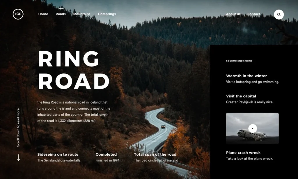
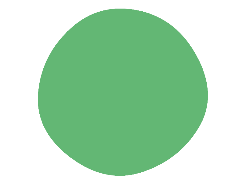
2. Organic Shapes
Credit: Pinterest ( https:// www.pinterest.co.uk )
There’s more to shapes than meets the eye when it comes to web design. Organic shapes are powerful design elements that go a long way in establishing a company’s online visual identity.
Shapes help web designers add interest and organise content in a visually appealing way – leading the eye to the most significant sections of a website. But more than that, shapes can effectively be used to communicate a brand’s vision, identity, goals, and ultimately, drive conversions and sales.
Incorporating organic shapes will certainly help make page elements stand out. They have a tendency to be based on nature, but free drawn elements can capture spontaneity, which is attractive on a website page.
With continued improvements in web technology, it’s become simpler for designers to step outside the typical ‘grid’ parameters to express brand identity.
We have slowly started to pull away from straight lines that came with flat design, and are now moving into experimenting with fluid lines and shapes.
We’re talking about shapes that don’t even have a name, shapes that have shed their straight lines and instead emulate elements of life and nature. Geometric shapes provide structure while organic shapes evoke a feeling of life through the illusion of movement.
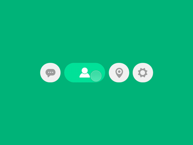
3. Micro Interactions & Animations
Credit: Oleg Frolov ( https://dribbble.com/Volorf )
If micro-interactions are only miniature design elements, why to care about them at all? Attention to details is what basically differs an exceptional website from an ordinary one. Here are a few reasons why micro-interactions are a must in 2021:
- They give tips to your users (in the form of a tooltip);
- They make it easier for users to interact with your website;
- They help make the user experience much more rewarding;
- They communicate information about certain elements, e.g. whether or not it’s interactive;
- They provide immediate and relevant feedback about a completed action to a user;
- They encourage sharing, liking, and commenting on your content;
- They direct users’
Call to Action micro-interactions essentially nudges the user to interact with an application or website. Call to action instils a feeling of achievement and also an empathy factor in user behaviour, and the best way to make your user interact with CTA’s is to make it engaging to entice interest of user.
4 Components of Micro-interactions
Triggers Are what cause the micro-interaction.
(Think of it as plugging in your phone charger, that’s a trigger).
Rules Define how a micro-interaction reacts or what’s supposed to happen after it’s triggered. (In our case, the phone starts charging).
Feedback Notifies the user what is happening during the micro-interaction.
(Here, the short ping sound made by the phone and charging animation indicating its charging).
Loops and Modes Defines how a micro-interaction reacts when it’s being used repetitively and the different ways a micro-interaction plays out.
Micro-interactions have a lot of potential that designers often overlook. If given the right focus, these micro-interactions, paired with a well-planned design, can improve user engagement.
4. Simple Data Visualizations
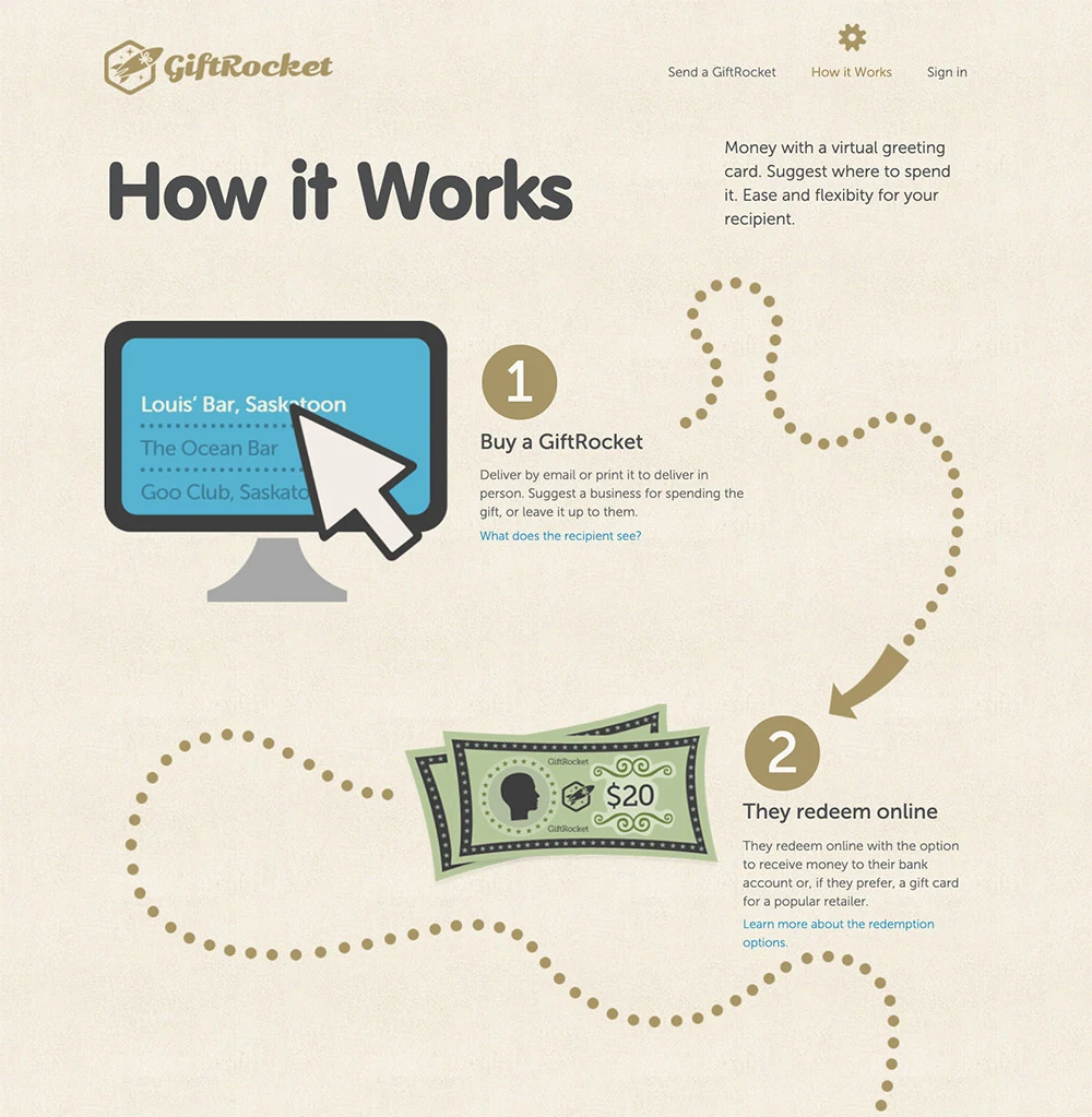
Communicating data in an engaging way can sometimes prove challenging. It’s certainly worth the struggle because it takes advantage of the fact that people are generally more responsive to visual elements, enabling you to convey your message about a service or product much more effectively.
What is Data Visualization? Data visualization is a graphical demonstration of your data that engage your viewers, helping them to want to learn more about your offering. Visual elements such as infographics, scatter graphs, charts and heat maps are some of the most popular ways to bring data to life.
Sharing information has become part and parcel of every business’ marketing strategy. More often than not, data isn’t just internally shared – potential consumers can be encouraged to become paying customers through data.
But sharing raw data holds little value to the viewer, you need to give it context so it’s easy to understand. You must however make sure it’s visually appealing – people don’t want to see a list of numbers or long paragraphs of text, data needs to be easily absorbed or people will simply scroll past.
This is why data visualizations have become so essential to visual marketing strategies. And for 2021, it will be simple visualizations that entice people to engage with your message. Today web designers and developers alike, can count on plenty of options when creating interactive graphical presentations of information using languages and tools like CSS, Javascript, jQuery, etc.
GiftRocket.com does a great job at visually simplifying their process with regards to applying for a gift card.
5. Thumb-Friendly Mobile Navigation

Responsive design simply isn’t an option anymore. Your website should work well and be easy to use on mobile devices. However, in 2021, website designs will continue to be focused on creating layouts that are thumb-friendly.
What exactly is “thumb-friendly”?
We’re talking about the way we use our phones. If you’re reading this article on your phone right now, look at how you’re holding it. Your fingers are likely wrapped around the back of your phone (or around a phone grip), leaving your thumb to do all the work. It’s important to understand how users typically hold their mobile phones and then incorporate this into your mobile web design. Here are the three main ways users hold their phones:
- One-handed, using the same thumb on that hand;
- One-handed, cradling the phone using the opposite thumb or forefinger;
- Two-handed, using the thumbs on both
The ‘thumb zone’ is the area on a mobile screen that is easily reached by the thumbs. The natural part of this zone covers the central portion of the screen and downward since this area is easy to reach using the thumbs for both right and left-hand users. The further away from the natural zone a user must reach, the more difficult navigating a mobile website can be.
The main goal for effective mobile web design is to keep the most important functions within the central and lower thumb zone where they can be easily used, regardless of how the user chooses to hold their device. This may be easier said than done, especially the way mobile screens are continually growing in size while thumb reach remains the same.
6. Progressive Lead Nurturing & Dynamic Forms
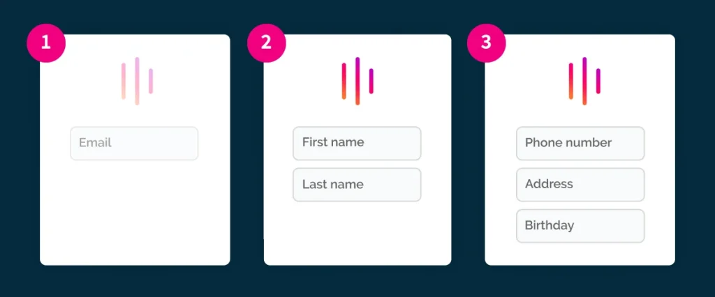
Progressive profiling is a method of collecting relevant information on your leads, through dynamic form fields, to ask for and collect information on users based on the information you already have about them.
Such questions may include; What’s your name? What’s the best contact number to call you on? How can we help? Then, as the customer’s interaction with your service continues (and greater trust and brand recognition is built), more questions are asked – helping you to not only capture leads, but build on the intelligence you’ve gained.
By using progressive and lead nurturing forms on your website, you’re able to progressively ask for new pieces of information about your lead using the same form each time they interact with it. Progressive forms allows you to learn more about your website visitors’ interests, requirements, and demographic profiles each time they interact with you online.
What are the Benefits of Progressive Profiling?
Progressive profiling is a valuable marketing tool for strengthening and qualifying your leads that saves you time, avoids repetition, and leads to higher conversions. With this, your visitors will enjoy a more tailored, user friendly experience on your site and hopefully become paying customers. Here are 4 benefits:
- Shorter lead forms;
- Higher conversion rates;
- Collecting more relevant information about your leads;
- Building more genuine relationships with your leads and
When used appropriately, progressive profiling allows you to gather important information, as well as build lead intelligence on repeat conversions. In a nutshell, it enables business owners to capture lead data without being annoying or aggressive.
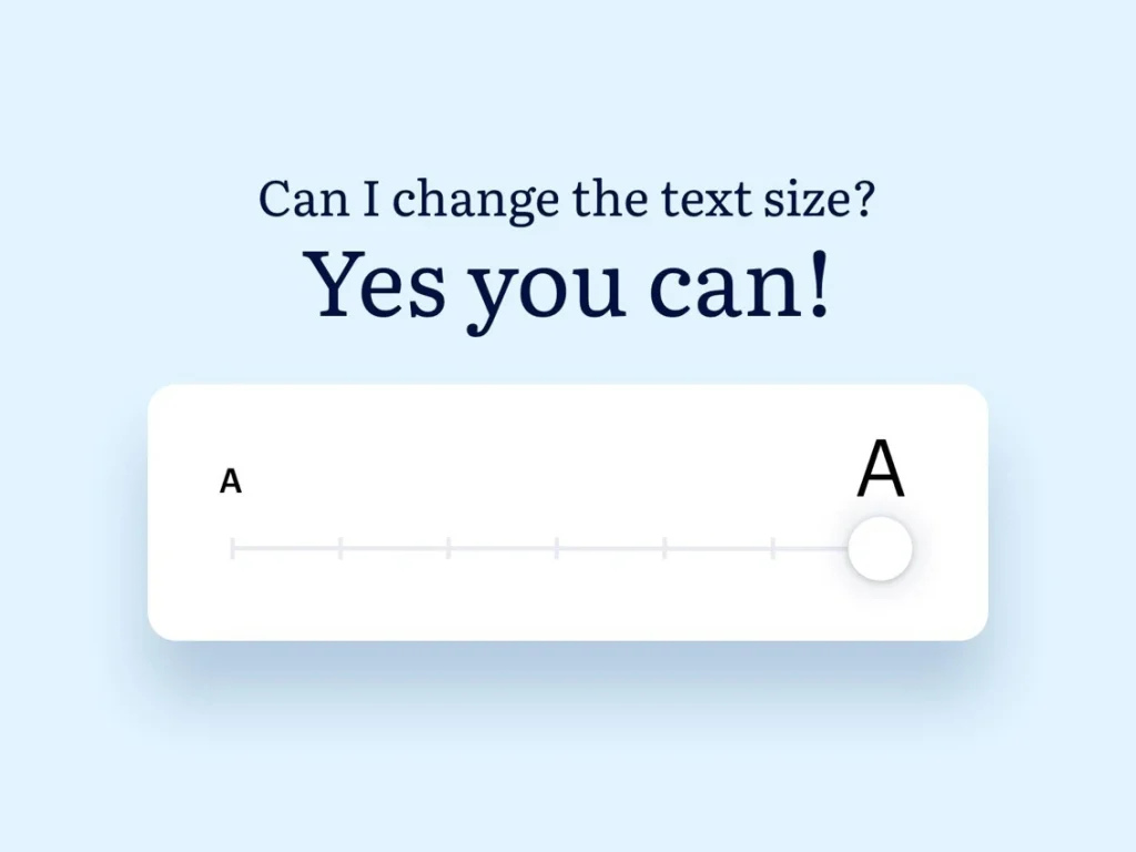
7. Accessibility and Availability
Credit: Dribble ( https://dribbble.com/joinblink)
When websites and web tools are appropriately designed and coded, people with disabilities can use them much more efficiently. However, many websites today are developed with accessibility barriers that makes it difficult or impossible for some people to use.
“The new WCAG 2.2 release impacts 2021 Web Accessibility”
– Source: EssentialAccessibility.com, September 2020.
W3C has specified that this update delivers additional support for website users with cognitive and learning disabilities, those with poor vision, or with specific disabilities, on mobile devices.
Making websites accessible benefits individuals and businesses. International web standards define what is needed for accessibility. The main types of disability to consider are people with:
- Visual impairments;
- Hearing impairments;
- Mobility impairments;
- Cognitive
Elements that improve accessibility include:
- Producing strong colour contrasts between the content and backgrounds;
- Using labels and instructions on forms, rather than low-context placeholder text;
- Using practical alt tags for images (which also boosts SEO!);
- Adding focus indicators, such as the rectangular outline that shows up around links when using keyboard navigation;
Having a site that every visitor can navigate and interact with is more than just part of good customer service and providing an excellent experience. It can increase conversion, boost your SEO, and help you reach a bigger audience.
To conclude, all website users benefit from accessible web design, just like we can all use automatic doors and other accessibility features often found in the physical world. Consider your user’s intentions and find ways to align their website behaviours with your business goals.
8. Website Load Time and Page Speed
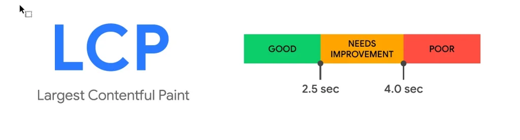
Page speed is nothing new and has long been a Google ranking factor. But in 2021, Google will be doubling down with the introduction of Core Web Vitals in the upcoming Core Algorithm Update. The new Core Web Vitals are a list of metrics created to help business owners, marketers, and developers improve user page experience.
What are the Core Web Vitals?
In May of 2020 Google announced their new Page Experience Update and the addition of Core Web Vitals. The Core Web Vitals will be added to a list of ranking factors which Google calls ‘page experience metrics’, as follows:
- Mobile friendliness;
- Safe browsing;
- Https;
- No intrusive interstitials;
- Largest contentful paint (under 2.5 for 75% of page loads);
- First input delay (under 100 milliseconds for 75% of page loads);
- Cumulative layout shift (less than 0.1 for 75% of page loads).
A slow website, on the other hand, makes us think it’s unsafe, insecure, and untrustworthy. And it’s really difficult to turn around that negative first impression. On the other hand, If your website loads fast, you’ve instantly made a strong first impression. It’s a quick win for user experience! If it loads fast, your new visitor is immediately happy.
Speed in 2021 continues to matter more so than ever before. It affects your user experience, as well as your search ranking. It affects your sales and conversions.
Conclusion
In 2021, we expect to see a strong emphasis of clean, bright, eye-catching websites that use animation and video to enhance the user experience. Updating your website’s design, and making sure it’s accessible, can have a positive impact on your brand and sales. If we had to summarise future web design future in 3 words, it would be: Fast, Accessible and Engaging.