Is Responsive Web Design Still Relevant in 2026?
Responsive web design became mainstream in the 2010s and quickly became the industry standard. But as user behaviour and devices have evolved, so has the way we approach it.
Put simply, responsive web design is all about resizing elements to fit different screen sizes, mainly by scaling desktop layouts down for mobile. However, this approach no longer makes sense in a world that’s obsessed with their phones.
Why the Old Ways No Longer Work
For most websites today, mobile traffic dominates. On many projects we work on, around 70% of visitors are using mobile devices. That shift completely changes how we need to think about web design. The old approach, starting with a desktop layout and adjusting it for mobile, no longer works as it treats mobile users as an afterthought.
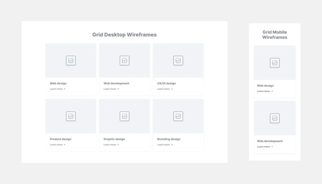
Think about a typical desktop design with three evenly spaced columns side by side. They look great on desktop but on mobile, those columns typically stack vertically, which on some sites might work fine but for most sites this leads to users endlessly scrolling, making for a frustrating user experience. Today’s users expect instant access to information and if they don’t get it, they’re gone. With platforms like TikTok setting the standard for fast, seamless content consumption, websites need to match that pace. If visitors can’t find what they need immediately, they won’t stick around scrolling, they’ll leave.
The Mobile-First Mindset
This is where mobile-first design comes in. This means, instead of shrinking desktop layouts, this approach starts with mobile usability in mind first (as most people are using their phone to view your site today). Wireframing, prototyping, and functionality are built for small screens first, ensuring a seamless experience from the get-go and then scaled up for bigger screens.
The Shift to Mobile-Optimised Web Design
This change to mobile-first responsive web design unlocks a world of creative possibilities. Instead of simply stacking elements like in a traditional responsive framework, mobile-optimised design introduces:
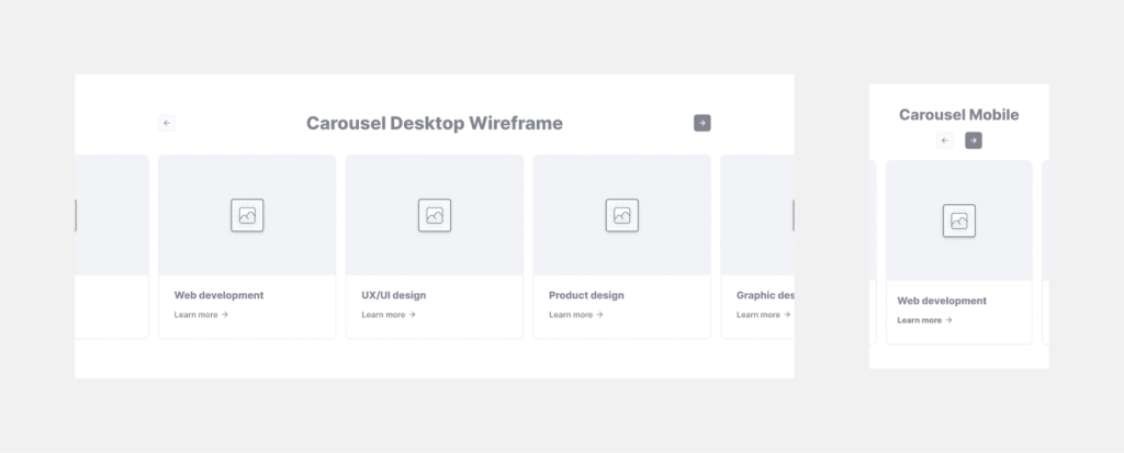
- Interactive carousels: Instead of stacking three columns, users are able to swipe effortlessly between them.
- Touch-friendly navigation: Buttons, sliders, and interactive elements that feel intuitive for finger based browsing.
- Smart animations: Subtle transitions and movements that enhance the user experience without overwhelming it or slowing it down.
These techniques reduce excessive scrolling and create a dynamic, user-friendly experience that feels modern and intuitive.
Frameworks and Flexibility
Many responsive designs rely on frameworks like Bootstrap or Tailwind CSS to handle stacking and resizing. While these tools are useful, they often create rigid, outdated designs. Off-the-shelf site builders or pre-made themes, only make this worse, leaving brands with a generic design that fails to truly meet their needs.
By contrast, custom-built, mobile-optimised designs (which we happen to specialise in!) offer complete creative freedom. They allow designers to craft experiences tailored to the brand and audience, rather than forcing users into a one-size-fits-all template.
Responsive Design vs. Mobile Optimisation: The Verdict
So, is responsive web design still relevant in 2026? Yes, but not in its traditional form.
While all websites must be responsive, simply resizing and stacking elements isn’t enough anymore. Users expect fast, interactive, mobile-first experiences that cater to their needs, not just a squeezed down version of a desktop site.
For brands and designers looking to stay ahead, the choice is clear: don’t settle for “good enough.” Instead, embrace a mobile-optimised approach to create seamless, engaging experiences that keep users hooked in 2026 and beyond.