Visual Hierarchy in Web Design: The Ultimate Guide for 2026
When it comes to considering the User Experience and User Interface of web design, there are many different areas to consider. From the Usability of the website to the Accessibility to ensure all users can interact and engage with the content. But there is one more obscure area which at first glance can be harder to understand, which is Visual Hierarchy.
Read on to discover what Visual Hierarchy is, its core principles, and why it’s important in Wireframing and Design.
What is Visual Hierarchy?
First and foremost, what exactly is Visual Hierarchy? Visual Hierarchy refers to the arrangement of design elements that encourages users to view the most important information first. From main Calls To Action, Featured Services or a company’s USPs (Unique Selling Propositions), Visual Hierarchy is key to ensure users are being made aware of the most essential content first, the next important details second and so on and so forth. Playing a crucial role in all stages of Web Design and Development, Visual Hierarchy guarantees that relevant messages stand out while also retaining an intuitive and interactive User Experience.
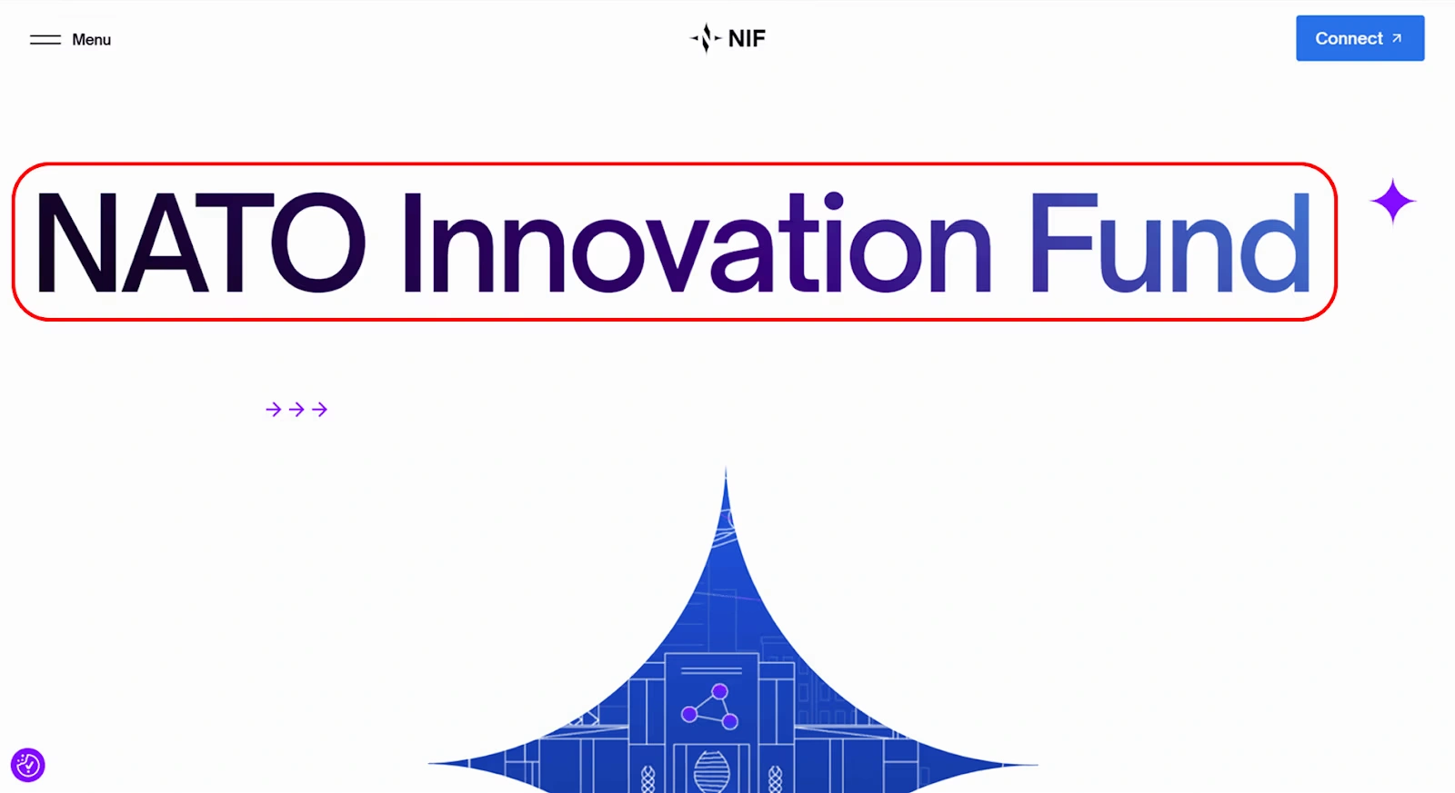
- The Hero is the largest section on the site, and is what users will see the moment they load on the page. There is a large bold headline detailing their ‘Spring Collection 2026’, with a contrasting main Call To Action such as ‘Shop Now’ to encourage users to click further.
- The second most prominent section of the site is the Navigation Bar, which has a well spaced out list of pages which is clear to read and click on. This Header nav ensures users can find the right details and products they are looking for with no faff or confusion.
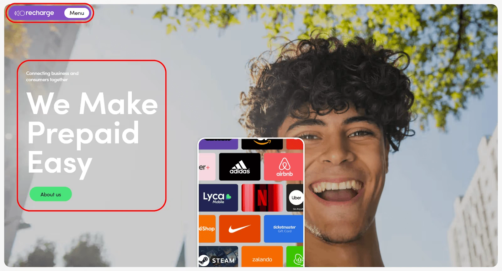
- Thirdly, below the Hero a section detailing a range of the sites Featured Products, with high-quality imagery, clear product names and a CTA to ‘View More’ of these types of products.
- Testimonials would be of lower importance but still relevant to the User Journey. This will be placed lower down the page with smaller text but still simple to view and read on. This section is key for users to feel trust with the company’s past products and is useful one users have become engaged in the type of product they are looking for.
- Finally, the Footer of the page is of least importance but still relevant. Offering links to all pages and their categories, with Policies and Legalities in smaller text at the bottom. This information is very much needed, but does not need to compete with content attempting to sell their products to users.
Why Is Visual Hierarchy Important?
Now we know what Visual Hierarchy means, why is it important? A well informed and organised Visual Hierarchy helps users quickly understand the structure and purpose of the page to discover the most necessary content for them, as the majority of users tend to scan sites, not read word for word.
Websites are more often than not built with key CTAs (Calls To Action) in mind, Visual Hierarchy allows to be directed to said actions. Without the use of Hierarchy, CTAs would blend in too much and would be missed, users would be unsure where to go next, and in turn would cause lower conversion rates due to having no clear direction. This is why on e-commerce sites for example, products have a bold ‘Add To Cart’ button right below the product, making it the clearest element on the page and high up on the Visual Hierarchy.
It’s not just the readability and organisation of the content that Visual Hierarchy helps with, but the Branding and Aesthetic of the website as well. A visually engaging website gives a strong sense of credibility and reinforces their brand assets and identity. Having a structured layout with relevant design elements gives users a sense of professionalism and trust with the company, the use of consistent fonts, key branding, spacing and the use of colour theory, creates a powerful and informed brand look and feel.
The Principles Of Visual Hierarchy
So we have the definition and importance, now for the final piece of the trifecta, the principles.
Visual Hierarchy is created with the uses of many core principles that guide users to engage with a website. These principles allow content and elements to be shown in an interactive and informative way. Below, we’ll explore these key principles and how they help.
Sizing
When it comes to design, size really does matter!
Large elements on a website appear more important than others and this is why website designs make use of larger header text compared to body text to ensure the main points stand out.
Proportion is key, if everything’s the same size, nothing catches the eye. Well considered Visual Hierarchy involves using different sizes of elements to create contrasting sections and allows attention to naturally flow to the main areas of content.
Increasing an element’s size (in terms of dimension) or its scale ( its size relationship in relation to other elements) is by far one of the easiest ways to emphasize it and draw attention to it.
Similarly the reverse can be applied throughout design. Creating elements that are smaller in size or in comparison to other neighbouring objects can deemphasize them and draw the focal point away from them.
Consider the terms and conditions on an offer or deal – companies do not necessarily want to draw attention to them, so they design in a small and subtle mannerism.
Colour
When we think about the psychology of colour, we typically start to think about blue inciting a sense of calm and red triggering a stress response. In visual hierarchy, we can extrapolate the psychology of colour to further encourage our users to behave in a desired way. For example, we can use colours to sign-post our users to the most valuable or important information on a site. We can use bright colours to attract attention to calls to action, and we can utilise contracting colours for contrasting themes or arguments throughout our content.
Vibrant and well saturated use of colour gains the attention of users, while neutral or toned down colouring blends with the background.
The human attention span has decreased, and as designers, we are in a constant fight with an increasingly fickle attention span to grab the attention and incite action. You can use visual hierarchy to incite action by:
Emphasise that really important information in the same colour throughout your content.
Use contrasting colours for contrasting points or themes throughout content.
Save a colour of your brand’s colour palette (we would recommend the most eye-catching one!) for calls to actions and buttons
Contrast
So we’ve had a look at why colour is so important, now it’s time to take a look at contrast.
The use of contrast allows specific elements to stand out among the rest, for example a dark button on a lighter toned section will draw users to view it easier, or vice versa.
As your users interact with your website more and more, they will become more and more comfortable and familiar with your brand. Contrary to popular belief, venturing outside of your brand guidelines isn’t always a bad thing. In fact, utilising assets and colours that are contrasting to your brand guidelines is another way to signpost important or essential information to users.
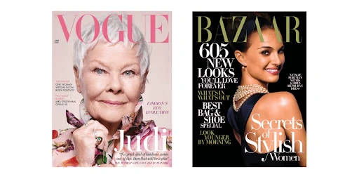
One of the best mediums that uses this strategy is magazines. Every article on the cover of a magazine is just as important as the other, they’re all fighting for your attention. More often than not, you’ll notice that the individual articles on a magazine cover will typically vary in font, size and colouring.
By using varying fonts, colours, sizes and tones throughout your copy and content, you can encourage the user to engage with more of your content than by maintaining a consistent brand style throughout.
Typography
Font sizing is a key principle throughout your Visual Hierarchy considerations, font size and weight automatically determine the order of reading for users. If text is bold or coloured it will naturally be more obvious for users, consider this when trying to reinforce key points in your content, such as the benefits of services a company provides.
Imagine a page where all the text is of the same size and weight. Whilst this would accomplish a sense of equivalency it would also make the page monotonous. There is a high chance you would land on the page, take one look and leave.
The use of different style fonts emphasises the brand identity of a website, serif is a good example of a traditional style, whereas sans-serif could be used for more modern, technology based sites. To avoid an overabundance of types, I recommend no more than 2-3 font types to maintain clear consistency of your branding.
Movement & Direction
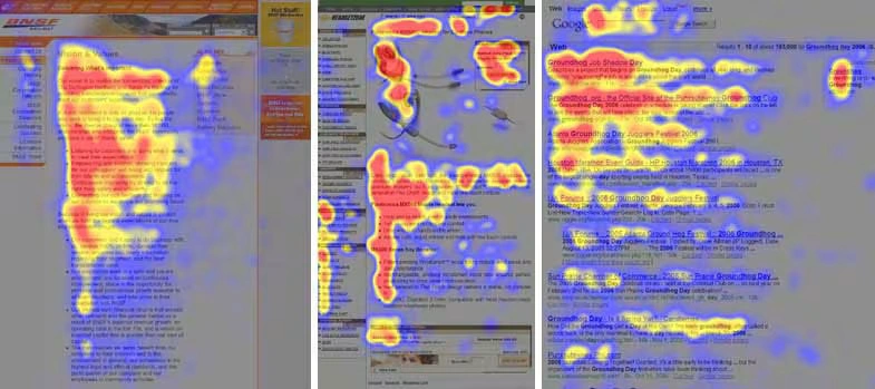
There are two main patterns eyes will follow when browsing a page, the Z-Pattern or the F-Pattern They work exactly as you may think with users’ eyes following the page in the shape of these letters.
The F – Pattern
The F was a pattern found to be popularised by NNGroups eye tracking study when studying the eye movements of hundreds of users looking at web pages. The F pattern was found to be applied when reading text heaver pages (Very much like this one)
A reader will scan the page in an F or ‘E’ format: Firstly across the top of the page to read the headlines, and then down the left hand side of the page looking for key headers, numbers or bullet points.
The Z – Pattern
The Z pattern reading focuses on pages or other documents similar to Ads or posters whereby information may not be presented in a block paragraph format. With a Z format pattern the user initially scans horizontally across the page where the important information is likely to be before moving diagonally across to the lower section of the page.
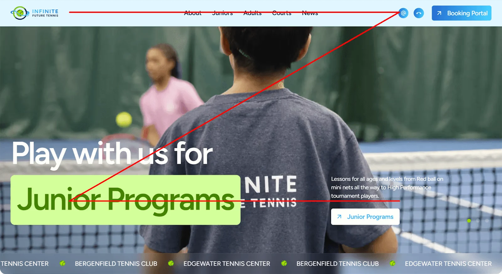
Alignment
Whilst it’s important to keep your content digestible, readable and comfortable for a user to engage with, there’s nothing to keep you from being a bit scandalous and breaking the rules of alignment. Standing out from the crowd is no bad thing, especially when it comes to those key pieces of information or data that you want your users to really pay attention to. So what does this look like in practice?
Well, you could…
Format key information with a central alignment instead of a left handed one.
“Align a quote from the right hand side. Users in the west will typically read from left to right. Aligning occasional pieces of information to the right is a good way to grab attention without making the reader uncomfortable.”
Chris Baker – CreativeWeb
What’s good for one, may not be good for everyone. So before publishing content, run it past trusted friends and colleagues first. A/B testing doesn’t always have to involve expensive task forces and think tanks.
Spacing
This principle is very simple to understand, if items or elements are close together they will be seen as related to one another, while more spaced out sections give the impression of them being separate entities.
In Gestalts theory of psychology, the proximity principle applies to grouping objects and elements together to form a perceptual organisation. Whether it’s minimalist, single page or flat website design, the use of proximity & space is a major factor to consider when separating content, or bringing it together. You might have two calls to action that are related, but are currently so far away from each other that it’s confusing for your users. Are they related? Are they not? Will clicking one do something entirely different to the other?
A simple but very effective example are words. When certain letters are grouped together such as ‘beat’ we see a single word. However, place a space between them ‘be at’ and we have a totally different phrase.
Make sure that your calls to action, buttons, and content are appropriately spaced, located and optimised for a seamless user journey.
The use of white space can also be very effective to reduce overly cluttered sections and enable better readability.
Conclusion – What Have We Learned?
Well there we have it! A brief summary of the definition of Visual Hierarchy, its importance and principles, so what have we learnt?
We’ve learnt that the foundation of effective website design is the use of Visual Hierarchy, it shapes how users engage and are informed by the content they perceive, as well as how organising elements based on importance can create exciting and user-friendly experiences.
A well-informed Visual Hierarchy improves usability in its own right, guaranteeing users can easily gain access to the right information for them to make informed decisions and to take key actions from product purchases to exploring more. With no clear Visual Hierarchy, websites become bland, hard to navigate and confusing to users, leading them to click away and end their User Journey before it even begins.
By making use of Visual Hierarchy’s key principles, the design of a website guides users attention in a free–flowing and natural way, letting them take the reins on their own exploration of an aesthetically pleasing and highly-functional site.
At the end of the day, web design isn’t just about the creative aspects, it’s also about communication. Understanding Visual Hierarchy throughout all phases of web design ensures the right information and takeaways reaches the demographic in the most effective and insightful way, making the experience impactful, informative and enjoyable.