Scaling Images on Mobile Devices and Small Screens

The Problem: Large images on small screens
Your images are undoubtably an important element of your website. They attract attention, inspire calls to action and help to tell your story or sell your products. So naturally you’ll want them to be as impactful as possible on all devices. But before you even begin to select the ‘hero images’ that you’ll use throughout your site it’s vital to understand how the content, size and layout of your images can be effected when your website design is scaled down to a smaller screen size.
One of the most common queries we receive from clients throughout our website build projects, is in regards to why and how their imagery appears differently on smaller screens.
To get the full effect of your large images you have to view the image on a screen wider than 800 pixels, which means you’re probably going to be selecting your key website images with your desktop design at the forefront of your mind.
However, there’s a reason that agencies are increasingly working to a ‘mobile first’ protocol when it comes to web design and that is that large images don’t always translate well to smaller screens. The scaling down of large images can cause inappropriate cropping and can even mean that some images lose their meaning all together.
What exactly is happening to your images?
Depending on the content of the image, there are several things that can happened when images are scaled down, that result in the picture having a completely different impact than intended.
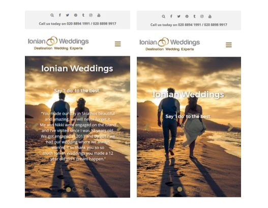
Example 1: Scaling without cropping
It’s common sense that a large horizontal, landscape style banner on your desktop, isn’t going to appear in the same way on a vertical portrait style mobile screen. The same image shrunk to fit a small screen may still be visible, but a great deal of clarity is likely to be lost and it will most probably lose the desired visual impact.
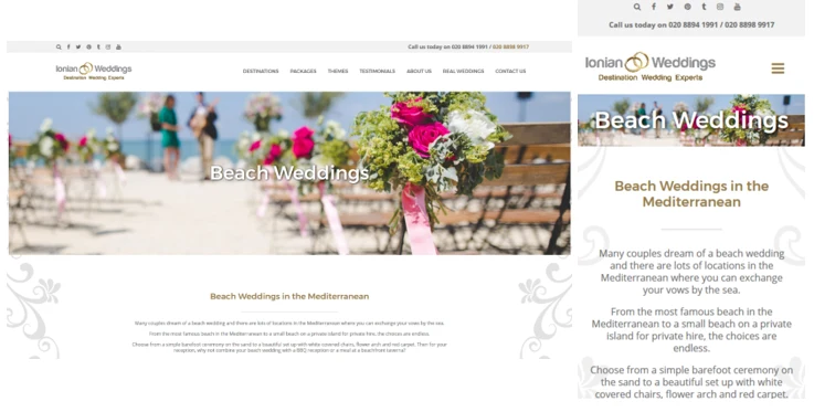
Example 2: Scaling with cropping
The image is cropped to fit the smaller screen, but in doing so, a portion of the image is lost and the image no longer has any context in relevance to the rest of the content on the page.
Example 3: legibility of text
Text is often overlaid or embedded in ‘hero images’ on a website. This can cause several issues, when you come to view these images on a small screen. When text is embedded it will shrink down with the rest of the image and could become illegible.
If text has been overlaid, the size and colour of text used can result in the text being hard to read and the image being hard to see, as the text is adjusted to fit the screen.
What are the solutions?
1. Remove the image
In some cases, you may need to accept that an image that works on a large screen, just isn’t going to translate well across all screen sizes in the way that you’d like. In this case you may decide to swap in a different image or depending on the purpose of the image, you may decide to remove it all together,
Regardless it’s good practice not to overload your site with imagery, as images can take up such a large amount of space on mobile devices. Images should be limited to only those that add real value to avoid excess scrolling and create an optimum user experience.
Consider removing your image if:
– Clarity is poor at a smaller size
– The meaning of the image is lost when it’s cropped
– It results in an unnecessary amount of scrolling
– It does not add intrinsic value or context to your page contents
2. Resize the image
Your large images may need to be cropped in a particular way in order to fit a smaller screen and this may require a little experimentation to find the best combination of re-sizing and cropping in order to create the most suitable image for the screen space available. It’s important to be aware that some compromise will be necessary on certain aspects during this process, in order to create the most optimal image possible.
3. Edit or move text
Image cropping, re-sizing and shuffling of text all go together to create a design that works on smaller screens. It’s almost certain that you’ll have to make some adjustments to the text associated with your imagery. For example, text may be displayed in a secondary area of the image on a large screen, but this area may need to be cropped out on smaller screen sizes. Therefore, text will be required to move to a different position or may need editing down to fit.
To Conclude…
In a nutshell there’s always going to be some cropping, re-sizing and editing required for your images and the text that goes with them, and compromise may be required in some areas in order to create a positive user experience for smaller screens.
When reviewing your images, ask yourself this key question: Does your image add value to your site and is it meaningful to users. If not, remove the image, if yes, carefully edit the image in a way that allows it to retain meaning and value, and be aware that compromise will probably be required.